Creative Hotlist
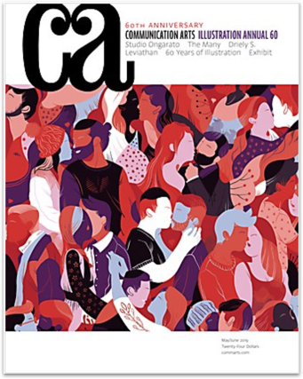
Creative hotlist is a subsidiary company to Communication Arts. Communication Arts, founded in 1959, is one of the largest creative magazines in the world and was the first major publication to launch a web presence in 1995. Part of the initial launch was a career section that included listings of jobs available and wanted ads. This section quickly became a premiere career resource for the professional creative marketplace and was relaunched as Creative Hotlist in 2001.
Since 2001 Creative Hotlist has not updated the site. The current site is clunky, crowded and outdated. Since then they have lost their frontrunner position in this industry. Today creative hotlist gets about 245,000 monthly visits but only has 56 active job listings. My team and I redesigned their website to be responsive, have more intuitive navigation, and to look more modern.
Discover
The goal of our research was to find out what was important to users when searching for a job. We also wanted to find out what they felt was difficult or lacking on other competitors sites.
Competitive Analysis
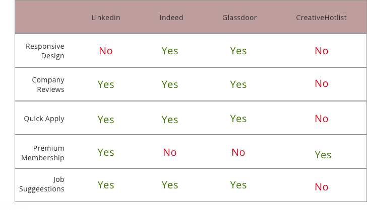
We analyzed some of the top competitors in the job search market which was indeed, linkedin, and glassdoor.
User Interviews
While we were not able to find any users of creative hotlist, we were able to find users that were currently looking for jobs to get insights from. The following is an example of a few questions I wrote for our interviews:
-
What devices do you usually use to search and apply for jobs?
-
What could be better about how you do this?
-
Which tool do you like to use the best?
These questions gave us some of our most useful insights. We found that most users were searching for jobs on mobile and saving them. Later, they would do applications when they had time to sit in front of a computer or laptop. We also learned that most people felt that their applications were lost in a sea of applicants and that their application wasn’t going to stand out. As far as what tools they used to search for jobs most people liked different channels for different reasons. For example, some users mentioned they like Indeed because it offers a wider selection of jobs, but others like Linkedin because they feel it’s more professional.
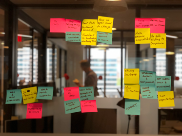
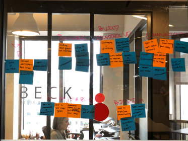
From here we were able to take all our findings and do some affinity mapping to help us see strong trends and focus in on what’s important.
Define
Persona
All this research is what brought us to our persona, Jenna, a young graphic designer who is looking for a career change.
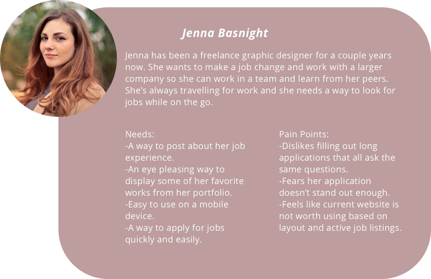
Since Jenna first attempted to use the site she has not had a very positive experience. The site is clunky on her laptop and unuseable on her phone.
Develop
Based on Jenna’s needs and pain points we identified our problem and hypothesis statement.
Problem Statement
Jenna comes across several challenges when using Creative Hotlist to look for jobs. She needs a way to browse and save jobs on the go. She also needs to be able to apply for jobs in a way that is both quick and thorough.
Hypothesis
We believe that by making a modern, responsive website for Jenna. We will achieve a better user experience. We will know this to be true when we see a 10% increase of monthly visitors to the site.
Iteration
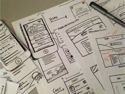
We began by doing a design studio and rapidly sketching out wireframes. This way we could narrow down our visual scope and agree on the layout.
User Flow
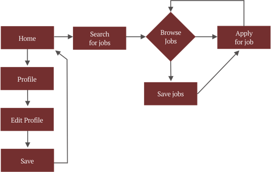
On the user flow we focused on the basics of what Jenna would need to do to update her profile, search and save jobs on the go and then apply for them on her laptop.
Usability Testing
Our usability testing followed the typical journey Jenna would take to apply for a job, starting from mobile and ending on desktop.
Tasks we gave our users:
-
Search for graphic design jobs (on mobile) in Austin, TX and save most recent postings.
-
On desktop update your profile and portfolio.
-
Search for graphic design jobs (on desktop) in Austin, TX.
-
Go to saved jobs section and apply for a job.
Main problems our users experienced:
-
Thought the pop-ups were way too big.
-
Were confused by the “request recommendation” section on the profile.
-
Wasn’t sure how to edit profile or portfolio once information was input.
What we did to solve those problems:
-
Reduced the size of the pop-ups to fit the screen better.
-
We decided to eliminate the “request recommendation” feature altogether. After meeting with our stakeholders we realized that was leaning too much like the social media function on Linkedin and they were looking to be purely a job board.
-
Added a dot menu on those pages containing an edit button.
Deliver
After user testing we iterated ad created hi-fi mock-ups and user tested again, this time with more success.
While our goal was to create a responsive site where users could easily display works on their portfolio, we wanted the visual design to look more modern to reflect it’s update.
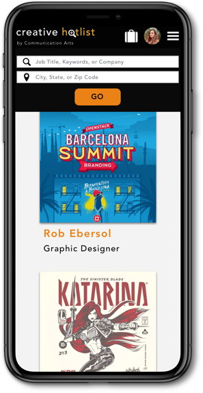
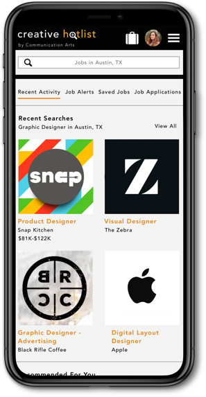
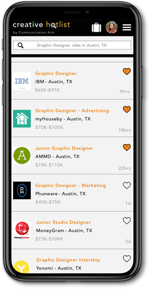
At the end of this project I felt that we solved Jenna’s problem and addressed her needs. But as this was only a 2-week spring there were more things we’d have liked to do had time allowed.
Next Steps
-
Create and test for an employer looking to hire candidates.
-
Flesh out and polish the UI.
-
Introduce a dar version of the site.